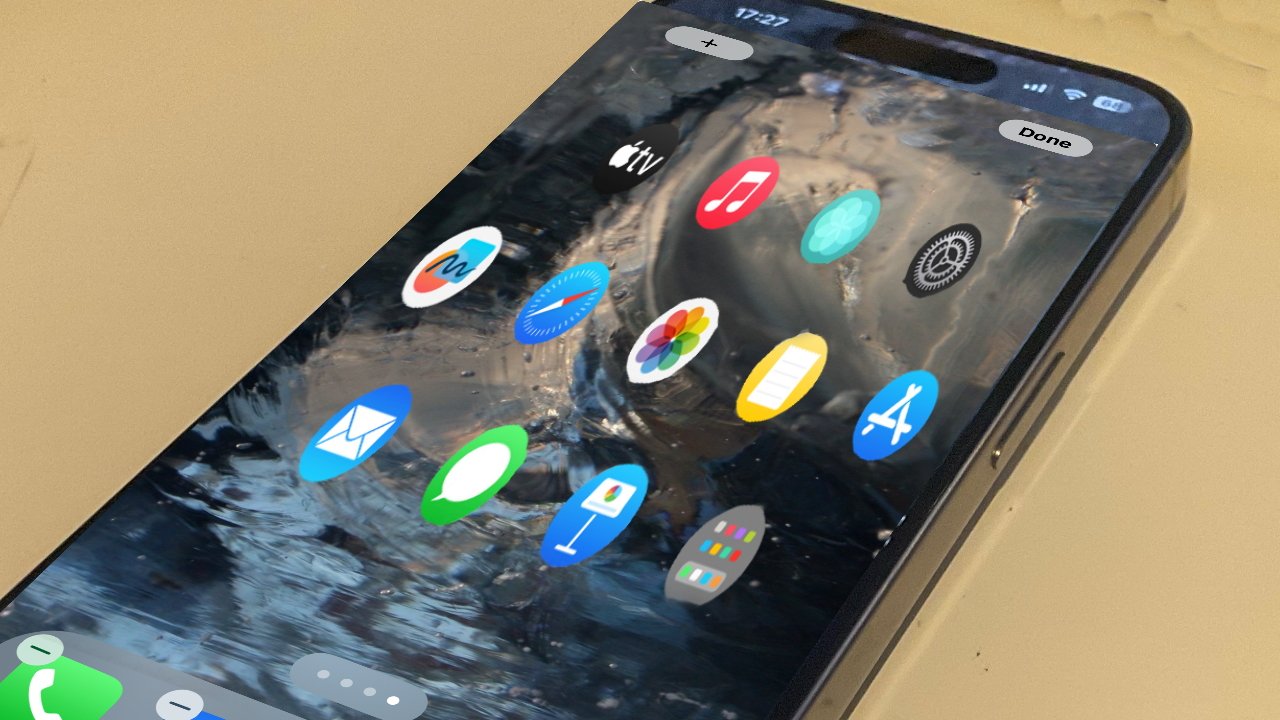
There have been so many reports of iOS 18 being a major redesign that sheer weight of claims makes it seem likely, but a new one saying it’s inspired by Apple Vision Pro puts the cart before the horse.
It’s not as if Apple is against introducing common features across its platforms — iPad widgets came to the Mac in 2023, for instance. And you can’t spend years designing one OS without learning lessons that can then be applied to the others.
Yet this new rumor from Hebrew-language publication The Verifier says that Apple is going to take the features seen in visionOS and rework iOS to be the same.
“The visionOS operating system is the model that Apple uses to update the user interface on the iPhone,” says the site, in translation. “The menus, built-in apps, Safari and more, will all be updated with a fresh design.”
This seems to be based less on any inside information, and more on how Apple recently redesigned its TV app on Apple TV 4K. That redesign brings a very slightly translucent columnar menu bar, which The Verifier says is like the controls on Apple Vision Pro.
“The new floating menu also comes to the iPad,” says the publication. That at least makes more sense than on an iPhone where the narrower screen means a floating — and by implication movable — menu has little room to move.
It’s as if The Verifier believes that since the Apple Vision Pro has come out, shocked iOS designers have been hurrying to catch up. It’s as if the publication believes that Apple is so keen on how its headset OS works that it’s keen to take it from perhaps 200,000 users, and put it in front of a billion iPhone owners.
Apple’s iOS designers have had years to see what Apple Vision Pro’ visionOS looks like, if they haven’t in fact been working on it for that whole time.
The visionOS software in Apple Vision Pro is very impressive. It has gaze detection so it knows when you’re looking at it, and it can respond to gestures made in empty air.
However, if you take away the elements that are specific to the Apple Vision Pro like this gesture- and gaze-detection, what’s left is a poor experience.
The apps in Apple Vision Pro’s home screen are iPad ones, unless they’re native, but the way they are displayed is more akin to the Apple Watch. They’re round icons, arranged in what’s closer to a honeycomb than a grid, and you can’t rearrange them.
The future of iOS
Apple could change all of its app icons to round, but it would make no functional improvement or even difference to how the apps are used. Similarly, it could add more translucent drop down menus, but even The Verifier says that was in the Apple TV app before it was in Apple Vision Pro.
What Apple could not take from Apple Vision Pro to the iPhone is the headset’s key ability to place windows anywhere around the user.
So it is only the weakest elements of visionOS that could be redeployed on the iPhone.
Anything could happen and it’s expected that something will, since reports claim that iOS 18 will feature a significant redesign. More often, that’s said to be because Apple will introduce more AI features into Siri, though.
But the notion that without any user benefit it, the iPhone will copy the round apps and translucent menus of Apple Vision Pro is absurd.
We’re not ranking the iOS 18 redesign rumor as unlikely because we think the revamp isn’t going to happen. We’re rating this particular report from this particular publication as unlikely, because getting the right answer from the wrong math doesn’t get you the same credit as a complete and right answer, start to finish.
