Whenever I have a random thought while using my iPad, there are plenty of places to quickly jot it down. But if I have the makings of a real idea, I generally want to keep it somewhere safe so it can it germinate and someday reach its full potential.
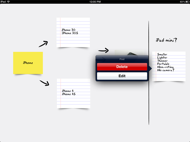
Concept understands that great ideas need room to grow. While it might seem like just another variation on the digital notebook, it’s actually more of a skeuomorphic mind mapper, adorned with scraps of paper, sticky notes, and mini Polaroids that keep track of your thoughts (and your thoughts’ thoughts).

I wasn’t sure that I’d like the simplistic interface, but something about seeing my words written on familiar office supplies worked here, and made me temporarily abandon my disgust for cheap digital copies. The use of things I would actually write on is more than a cute gimmick; where other apps use colors to keep like thoughts organized, Concept’s looseleaf squares and Post-Its make it much easier to see the path of my project. Photos can be snapped from within the app and added to your board, and everything can be moved or deleted with ease.
Like its name suggests, however, Concept is a work in progress. While the interface is clean and slick, none of the pieces of stationary can be resized, making it difficult to write more than a few lines at a time. The default handwriting-esque font isn’t so bad, but you can’t change the style or its color; plus, there aren’t any drawing tools, so you have to rely on the included arrow (which can be rotated but not resized) and divider. Sharing options are limited as well, with no PDF exporting or cloud integration.
The bottom line. Concept’s initial incarnation is a certainly a good start, but it still feels like it’s in the development stage.
Review Synopsis
Product: